Successful at the trade fair in Cologne: Tips for your trade fair booth
The Cologne Exhibition Center is one of the largest and most diverse exhibition venues in Europe. For many companies, it is the ideal place to...
4 min read
 Carina Gottschalk
:
Updated on November 6, 2024
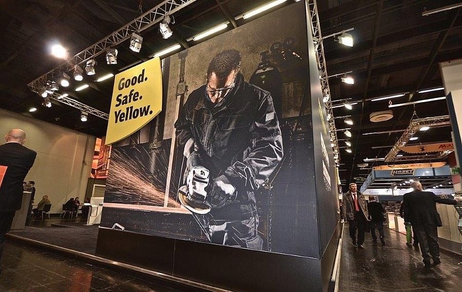
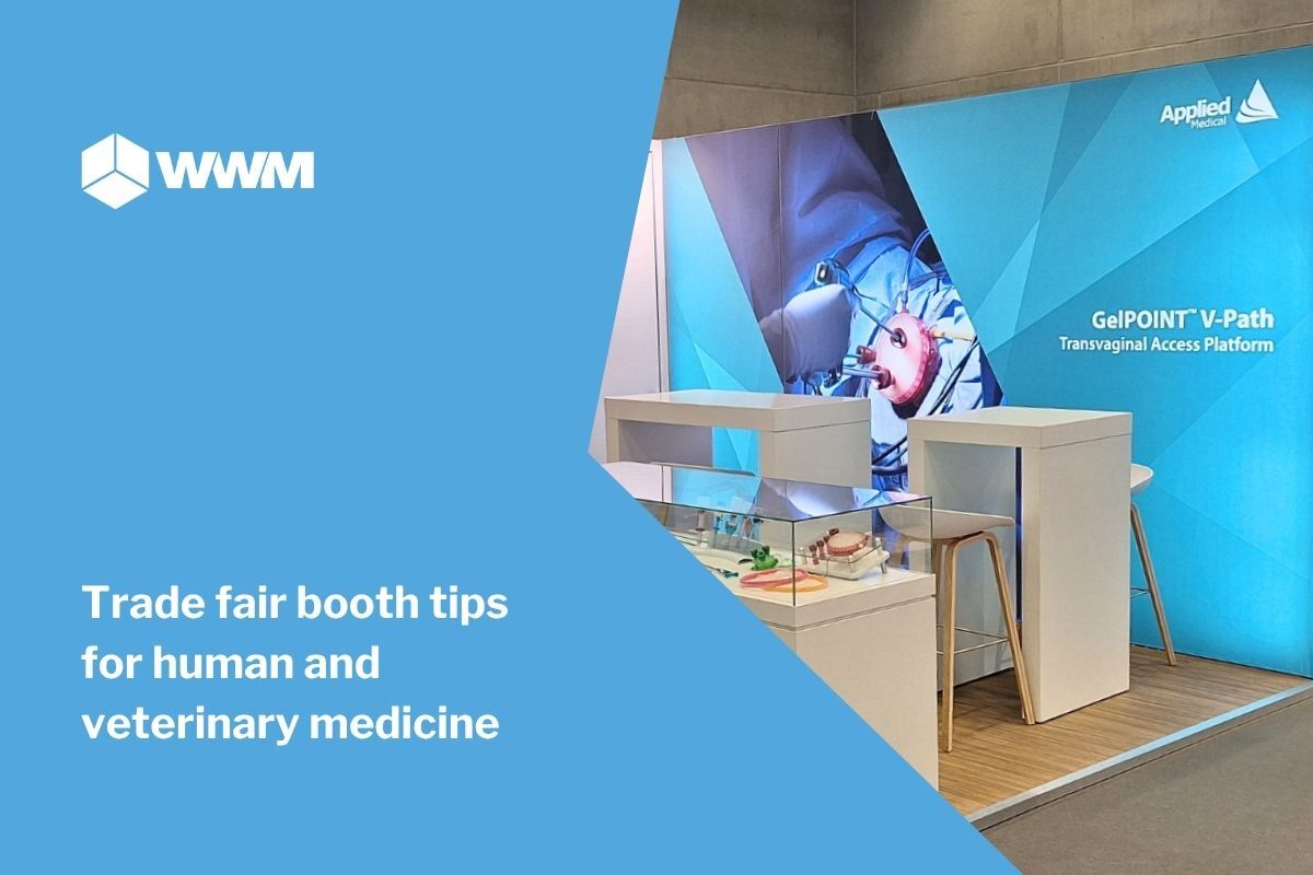
Creating a successful graphic concept is an enormously important part of trade fair design. The graphics often arouse the interest of potential visitors and convey the message of the exhibition stand. You can use furniture and walls to make your stand appear more informative or inviting. However, if this is not supported by the graphics, it will quickly destroy your concept. To ensure that the graphic concept and exhibition stand concept support each other and work together, you should urgently consider a few points.
The basic guidelines for design, such as the effect of colors and shapes, naturally apply to exhibition walls just as they do to other information media. However, you should never underestimate the size of a wall. What works on a poster does not necessarily work on a 4 m wall. A good guide here:
If your customers are standing directly in front of the wall, they will not be looking at text that requires them to strain their necks. The text on such walls should not be too large so that a sentence can still be read quickly. For walls that are further away (such as a suspension), the text should not be too small.
If you feel unsure about the design of the walls, it often helps to use the graphics in the 3D rendering of the stand. This gives you a better idea of how the graphics will look together with exhibition furniture and whether the viewing angle is suitable for important components.
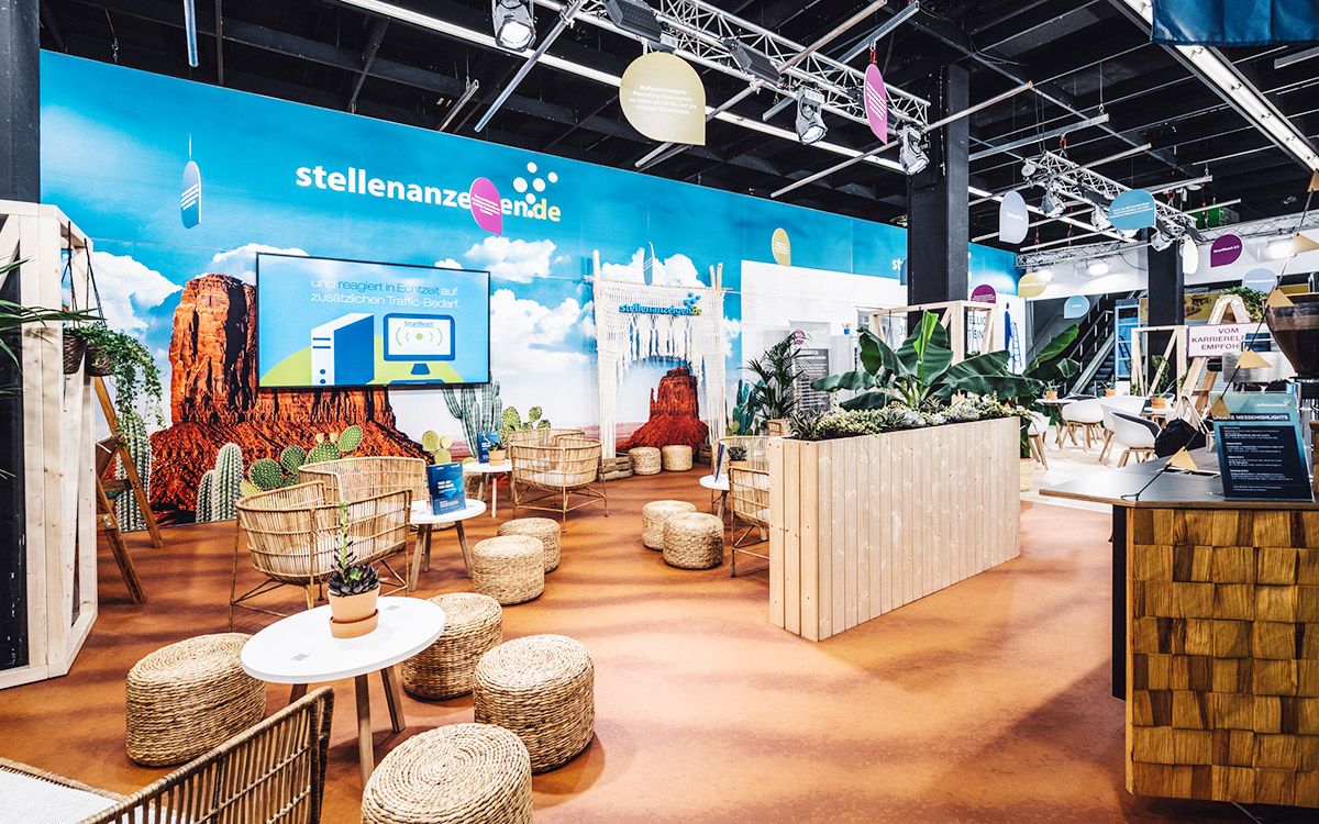
Recognizability is of great importance when designing a company. Whether on the web, stationery or business cards, your brand should be directly recognizable. This should not be neglected at the trade fair stand either. If your customers are looking for you at a trade fair, they will not only look for your logo, but often also for your colors or familiar designs. If the design differs too much, it could be overlooked or confuse customers.
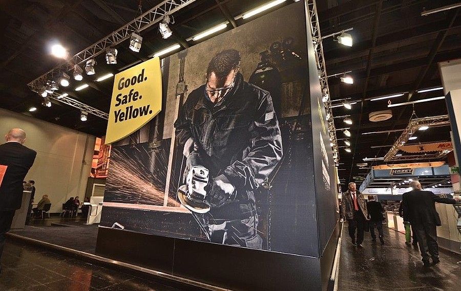
There are of course several options for placing eye-catchers on your stand that are not graphic. Depending on the possibilities available on site and your budget, however, this is a good way to attract attention. Large pictures, possibly backlit and properly staged by the stand builder, can really make your stand stand out. However, when selecting the images, pay close attention to their resolution. If in doubt, it is also a good idea to ask the stand builder at an early stage whether they will still work in the desired size.
When potential new customers come to your stand, it is an advantage if they know as quickly as possible what your company does. It is often not advisable to write a long text. The viewer will most likely not read this text if they do not know whether you are a good fit for them at all. Accordingly, it is advisable to briefly and concisely explain what you are about. This information should be easy to find and does not have to present your entire capabilities. If you are going to a trade fair where you are mainly expecting regular customers, you can consider neglecting this information.
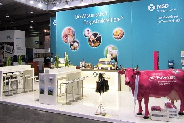
Don't try to display as much as possible on every wall. There is a general flood of visual impressions at trade fairs. Giving the eye a chance to rest could turn your stand into a calming oasis in the midst of the trade fair chaos. The use of quiet areas enhances the effect of the graphics and makes them much more pleasant and inviting. You often see stands at trade fairs where exhibitors have tried to display their entire product range on one wall. The intuition behind this is understandable, but these walls rarely appear calm and clear to the viewer. There is a risk that the customer will feel overwhelmed and not even want to start reading. Use your walls to arouse interest. Tell the viewer what it is about and arouse their interest in finding out more. In the best case scenario, they will then start a conversation with the stand personnel, where they will receive all the information they are interested in.
A supplement to this is the use of brochure stands. If you display several brochures, the customer can grab the topic that interests them and read it much more comfortably on their hand. A positive side effect is that he pockets the brochure and later has your contact details.
When creating your stand concept, you should decide how you want to present yourself. For example, if you want an exhibition stand to motivate people to linger and look inviting, create a comfortable combination of exhibition furniture with a cozy atmosphere. Or do you want to put your products in the foreground and convey information? Keep the chosen concept in mind when creating the graphics. With a lobby-style design, putting a lot of product information on one wall breaks up your concept and makes the stand look less good. It is helpful for a good graphic design not to lose sight of the message of the exhibition stand.
The difficulties involved in designing exhibition walls should not be underestimated. When choosing an agency, you should check whether it has experience in designing exhibition stands. Ask your stand builder for detailed information about the requirements for print data.
The graphic design of trade fair stands is closely linked to the concept of the stand. Let the graphics support this and make the viewer want to stop and start a conversation.

The Cologne Exhibition Center is one of the largest and most diverse exhibition venues in Europe. For many companies, it is the ideal place to...
Imagine: you enter the exhibition hall, surrounded by hundreds of stands and thousands of trade visitors. How do you make sure that your company...

Have you ever wondered how your exhibition stand looks from the perspective of your visitors? Many exhibitors invest a lot of time and money in...